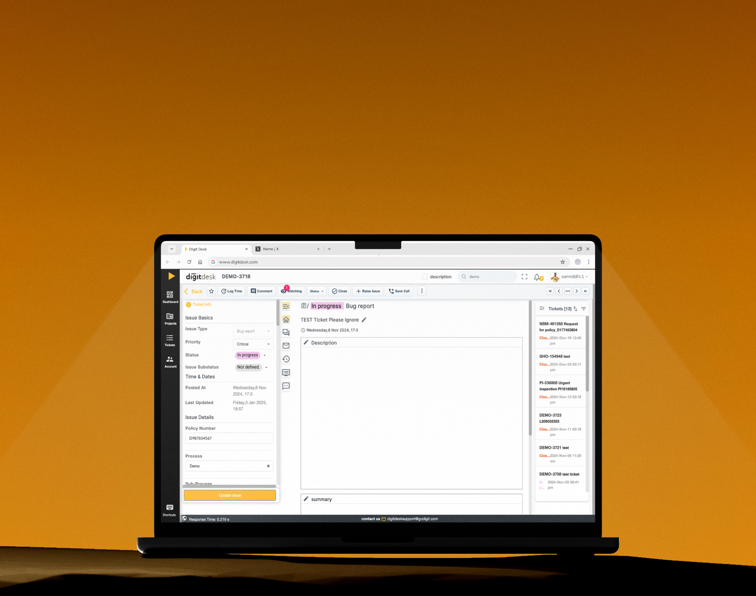
DigitDesk Redesign
Timeline: 3-4 Weeks

What Happens When Information Architecture Is Ignored for 3 Years?
3 Years of neglect in IA left Digit’s ticketing tool confusing even for the experienced users. This redesign brings clarity back to its most frequented screen used by 100+ teams.

Before

After


Home screen: 54% lighter
Broken items removed, related actions merged, complex ones tucked away
6 Fragmented Tabs → 2 Work Modes
Rebuilt around two real modes: understanding, then acting
Designed for Volume
Message cards rebuilt to scan
cleanly across long threads
Kept the Muscle Memory
High-frequency actions stayed where
users expected, so no relearning
Introduction
What is DigitDesk?
Digitdesk is an internal ticketing platform used at Digit Insurance to manage both employee support requests and customer complaints & claims.
Tickets are automatically generated when someone sends an email to a designated address (e.g.nonmotor-claims@digit.com). These emails are routed to the appropriate project in the Digitdesk dashboard where different teams can view, update, and track them.
This redesign was part of a larger overhaul of DigitDesk's entire system, but this case study focuses on the Ticket Details Page, the busiest & most frequented screen of the product.

Brief Description of How DigitDesk Works
Imagine you’re a Digit employee sending an email regarding a complaint to adminsupport@godigit.com.
Next

What was the Brief?
Make it Modern & Visually Better
An executive felt DigitDesk looked dated and asked for a redesign. The scope was already set: cleaner styling, new components, no structural changes. I started there, then ran a UX audit. It became clear the problems went deeper. A reskin would only hide them.
I pushed for a full revamp instead. It was approved, with limits from the legacy tech stack. The product was rebuilt around those constraints, not just restyled.
What was the Real Problem?
The Problem Wasn't Visual
The Ticket Details Page had slowly become a dense mix of buttons, fields, and buried actions.
The reason was simple: features were added for three years without rethinking how the page should work as a whole. What started as a single screen had grown into a confusing layout that even experienced users struggled to navigate.

Exhibit A
I asked the development team where starred tickets are saved? Turns out, the team also had no idea.
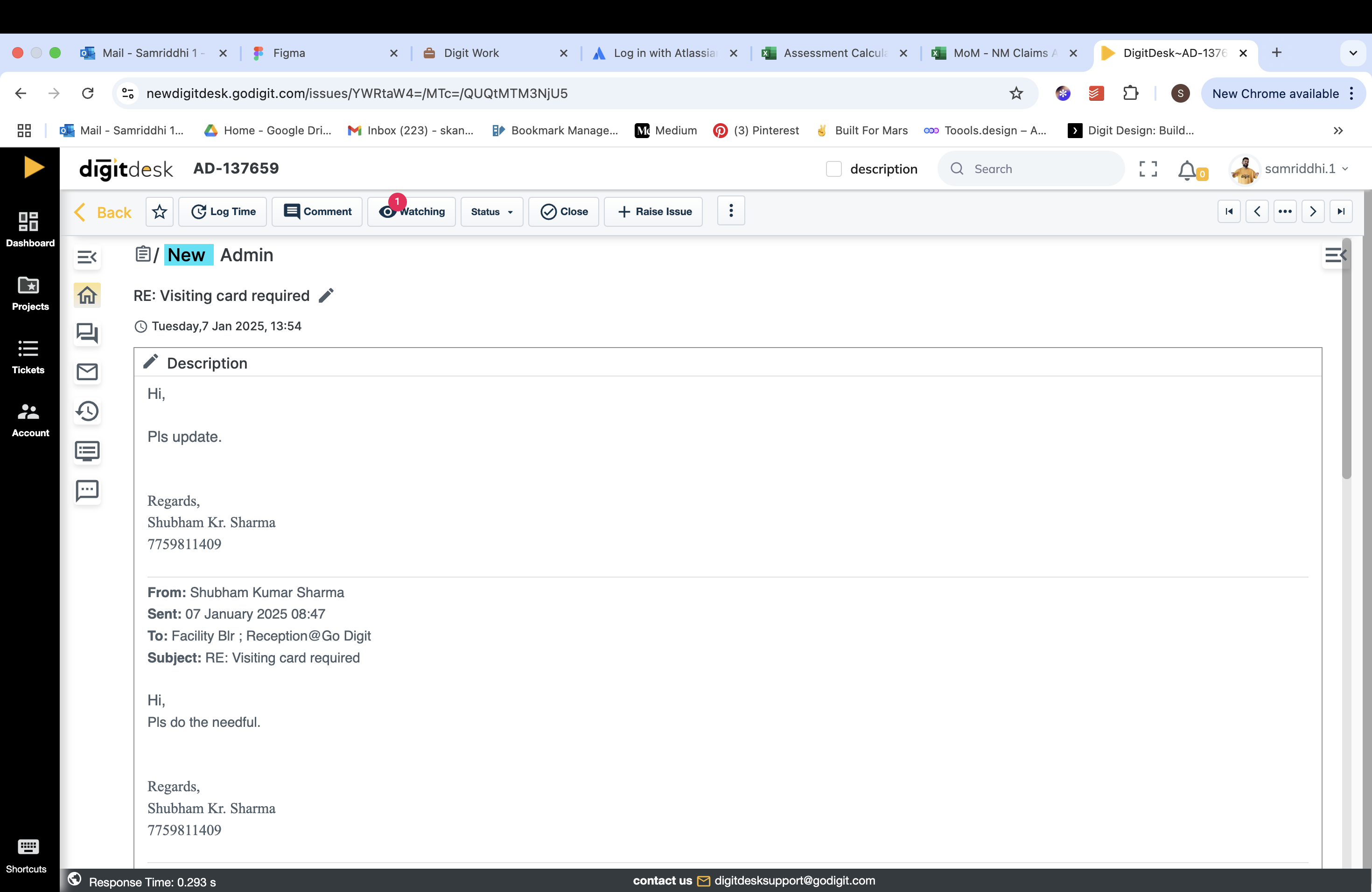
Snippet of Ticket details Page Toolbar

Exhibit B
Look at those elements that look like floating action buttons. They’re not. They’re tabs.
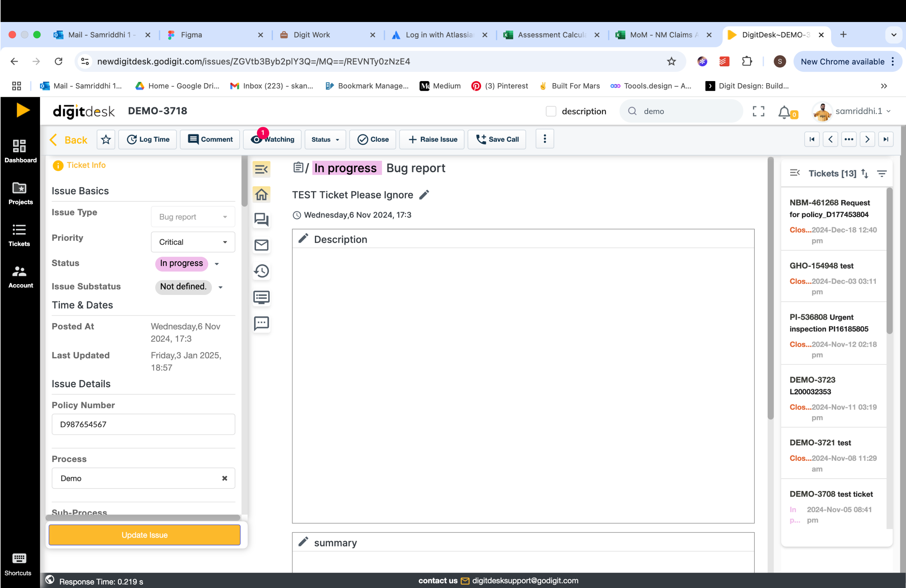
Snippet of Ticket details Page



For the Busy Bees, Here You Go
See Final Designs
Redesign Approach
Before Moving Pixels
I started with a UX audit to flag obvious usability and heuristic issues, then followed it with contextual inquiry and interviews to understand how teams actually used the product.

Zooming Out to See What’s Not Working
With Simplified Sitemap of DigitDesk
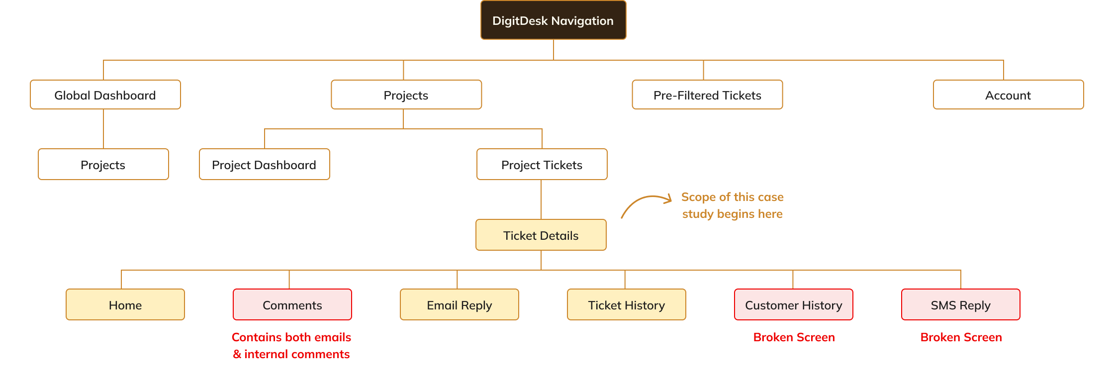
Contextual Inquiry Findings
The UI Was Guilty. The Workflow Wasn't Innocent.
The audit showed clear signs of cognitive overload- dense screens, competing elements, and little visual hierarchy, but it couldn’t explain how that overload affected in day-to-day work.

What was actually going wrong?
Fragmented Flows
Work was broken across the interface, forcing users to spend more effort managing context than completing tasks.
No one relied only on DigitDesk
Everyone jumped between multiple tools to complete a single workflow, e.g.- Non- motor team jumped between 6 different tools
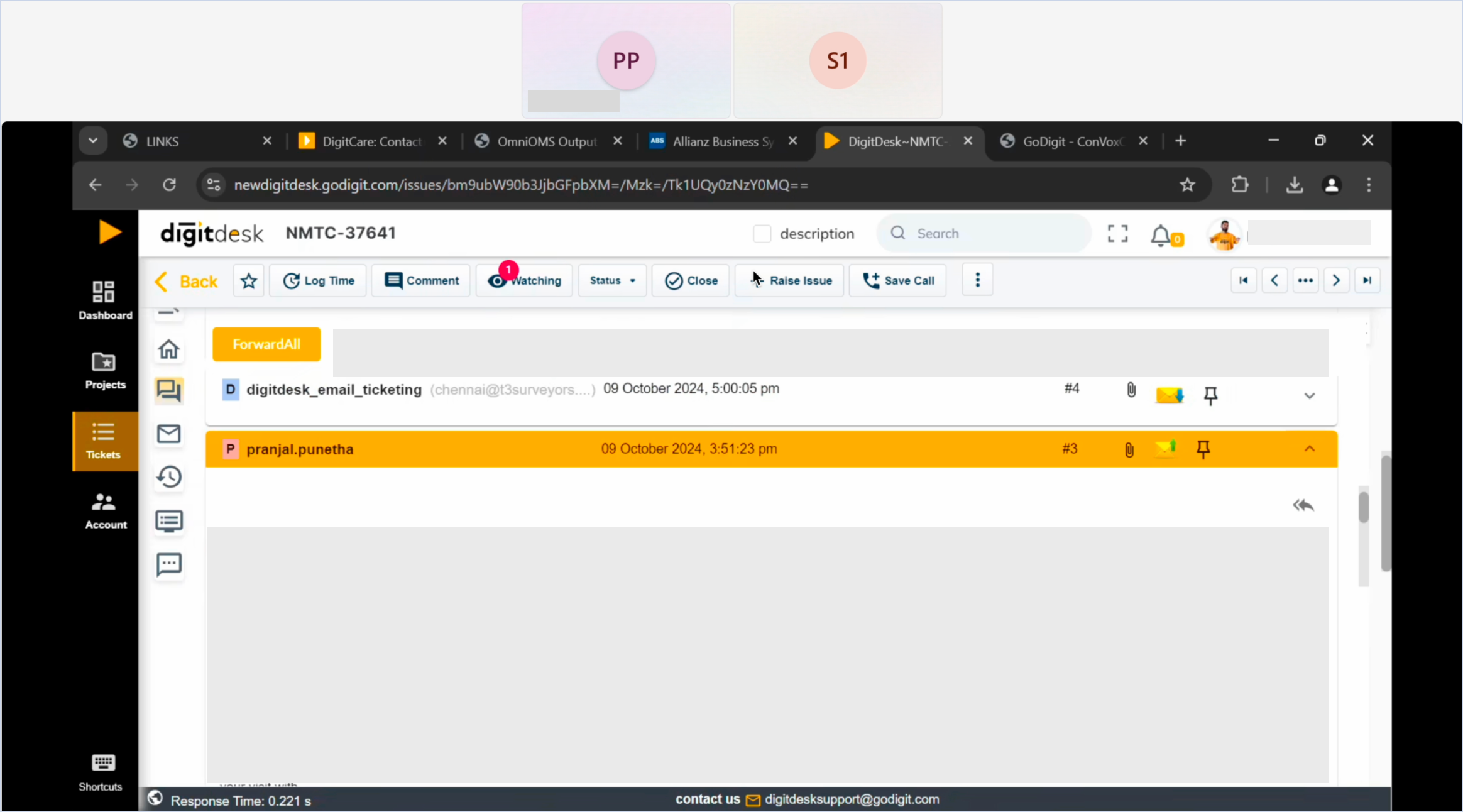
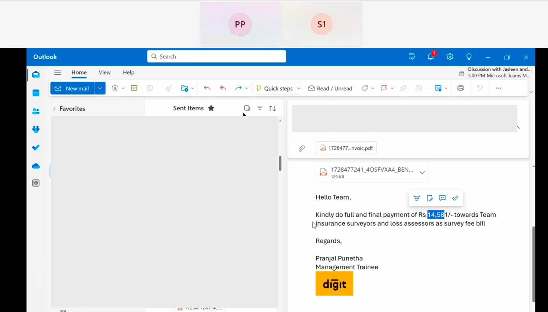
Screenshots of video call of Non-Motor Workflow
Context was Frequently Separated From its Action
Users often had to leave the information they were viewing in order to act on it.
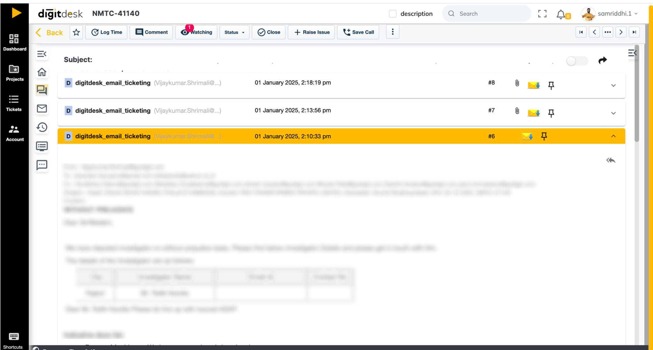
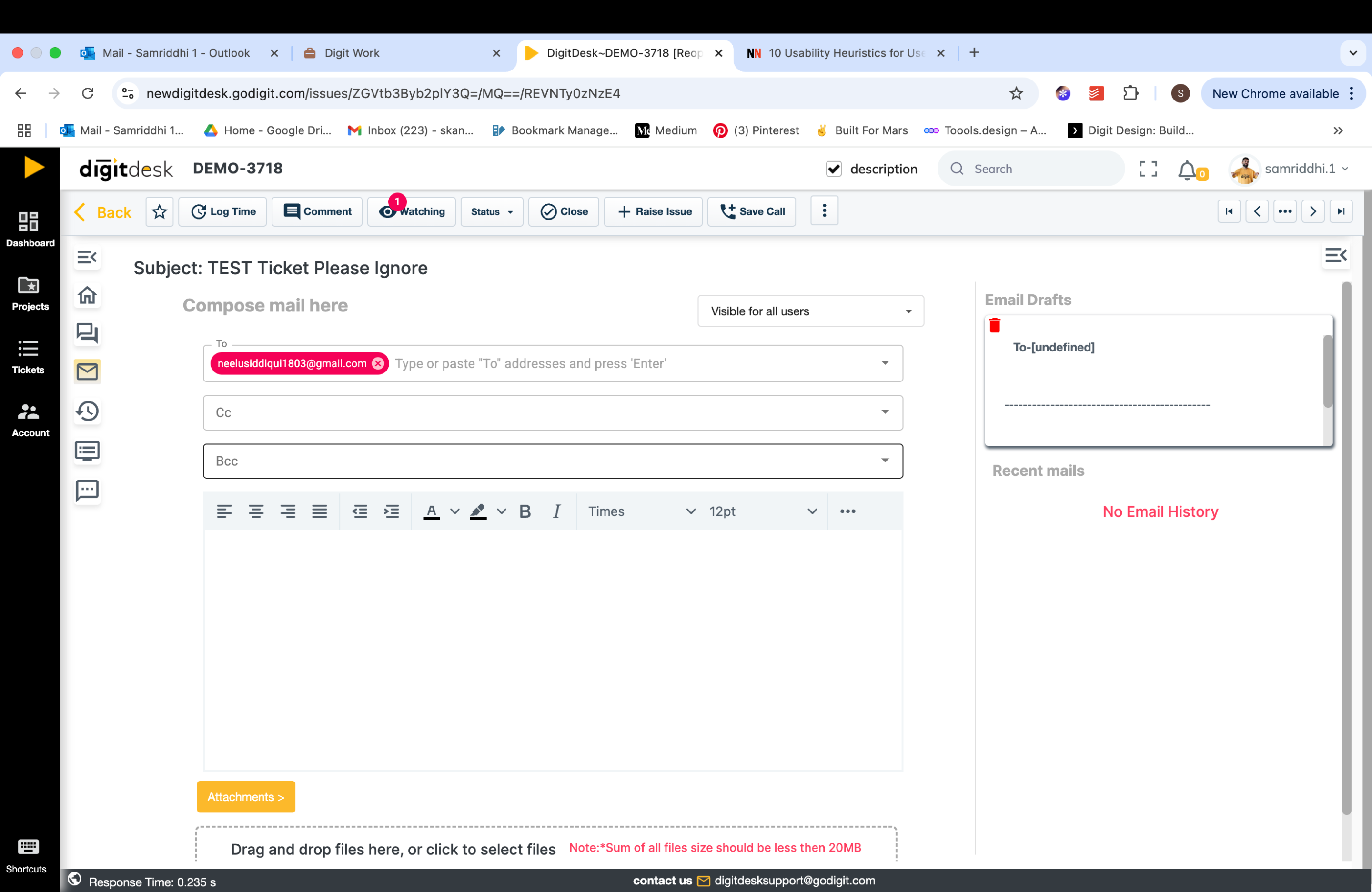
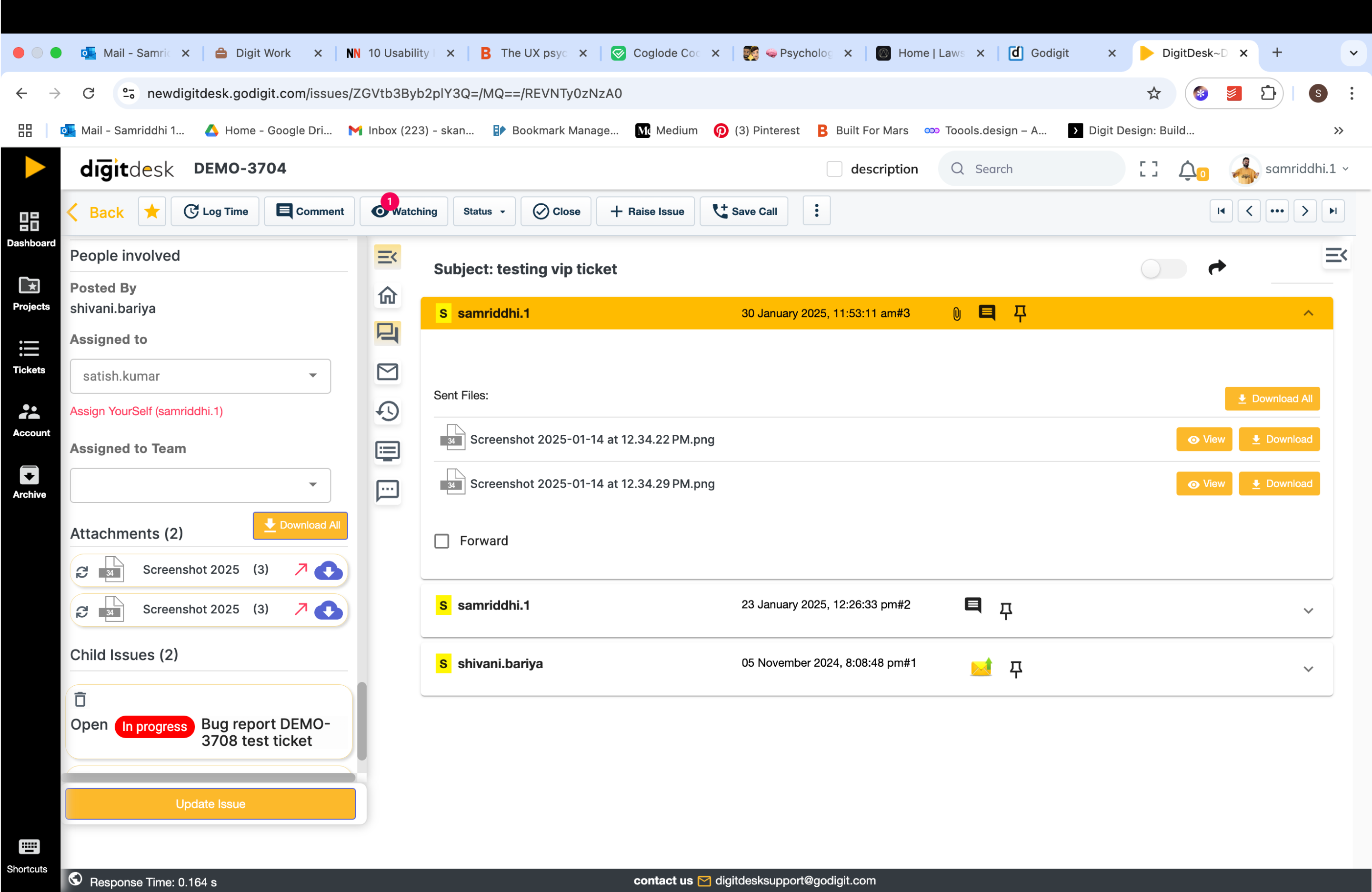
Replying to an email requires switching screens


Importance Didn’t Match the Placement
The interface failed to guide attention, making frequent actions harder to find than less important ones.
High-Frequency Actions, Low Visibility
The most-used elements assigned to & attachments were buried under outdated or broken features.
Assigned to & attachments are at the very end of this scroll bar

Ticket Toolbar was Bypassed, Yet it held an Attention Dominant Place
Most actions happened in the side detail pane, making the top toolbar nearly irrelevant.
Toolbar is usually not used, but utilises a high attention area
Sidebar is used often but is extremely overcrowded


Some Features like Drafts were Effectively Invisible
I asked the receptionist during an interview, who is a DigitDesk user about how often she used drafts. Her response was, “what drafts?”
Due to the placement, users didn’t notice them

Users Relied on Memory, Not the Interface
Because nothing was clearly prioritised, people started relying on memory and ignoring parts of the interface, which became obvious when new users tried to learn it and got stuck.
The Interface relied on Habit Instead of Clarity.
Experienced users navigated through muscle memory, while new users struggled without hierarchy or guidance.
Lack of guidance and signifiers on the screen
Users Weren’t Confused, They Were Coping
Over time, teams built workarounds, skipping broken features all together
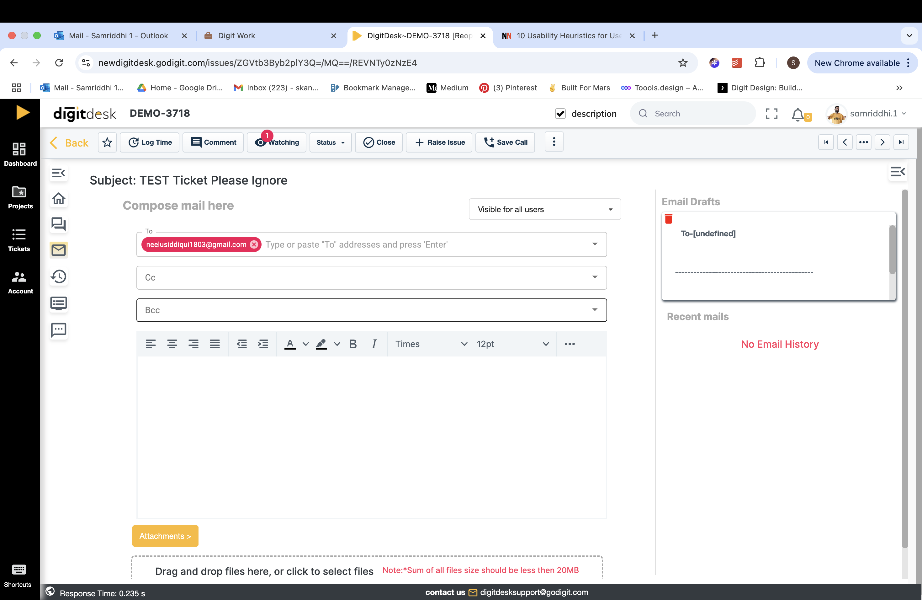

Some users copied the email they wanted to reply to, into the reply field as the reply page lacked context.
Distinct Usage Patterns Observed Across Teams
Instead of fixed roles, two distinct modes of work emerged, shaped by what needed to be done in the moment, and often switching within the same person, especially in smaller teams.
Operators - Working on the task itself and moving it to completion
Assigners - Moving the task forward when it depends on others
(Often the same person switches into this mode, especially in smaller teams or when work spans multiple teams)

User Mode: Operators
- Work on one ticket at a time, keeping flow
- Quickly understand the issue and take action on it
- Communicate with requesters & share documents
- Update status and details as they go


User Mode: Assigner
- Quickly review tickets for urgency and direction
- Decide who should handle it and set priority
- Share key context only if required
- Focus on quick decisions, not deep work
IA Redesign Approach
Fixing the Structure Without Forcing Users to Relearn
The redesign focused on stabilising what users already relied on, then restructuring the IA around real work patterns without disrupting familiar behaviour.
- Stabilise before restructuring:Broken, redundant, and rarely used elements were removed first to reduce noise and restore predictability. This established a stable baseline before introducing any structural changes.
- Reorganise around moments of work:Instead of grouping by features, elements were grouped by task similarity to keep related actions within a single flow.This revealed two core work modes that became the primary mental model of the page:
- Ticket Details - status, ownership, metadata of ticket - Primarily Used during Assigner Mode
- Communication - emails, replies, internal notes - Primarily Used during Operator Mode
- Preserve muscle memory while improving clarity:High-frequency behaviours already lived in the left-side detail panel. This side panel was intentionally retained, keeping status, assignment, and timestamps where users expected them, while improving clarity without forcing relearning.
- Use frequency to drive placement: Visibility was determined by how often actions were used, not by edge cases
Current Structure
Work-Based Grouping
Frequency of Attention
How the page was organised originally
Legend Key
Working Element
Out of Scope/Broken
Global Navigation
Ticket Number
Search
Notifications
Full- screen
Account
Top Toolbar
Main Toolbar
Back Button
Star
Log time
Watching
Comment
Status
Close
Raise issue
Save Call
Pagination
More Menu Options
Attach a file
Create new related ticket
Add Ticket Relation
Move Ticket
Clone Ticket
Split Ticket
Add reminder/Follow Up
Claim Operations
Details Side Panel - Left
Issue Basics
Time & Date
Issue Details
People Involved
Attachments
Related issues -> Child & Parent
Update Issue Button
Icon Tabs
Home
Comments
Email Reply
Ticket History
Customer History
SMS
Key Structural Changes & Impact
- The side panel was simplified to support focused actionUnrelated and dense information was removed, allowing the panel to function as a clearer space for taking action without competing context.
- The toolbar was restructured to bring context before actionBrief ticket details are now shown upfront in the toolbar, so users can first understand what the ticket is about, with less-used options pushed aside, since most work happens in the side panel.
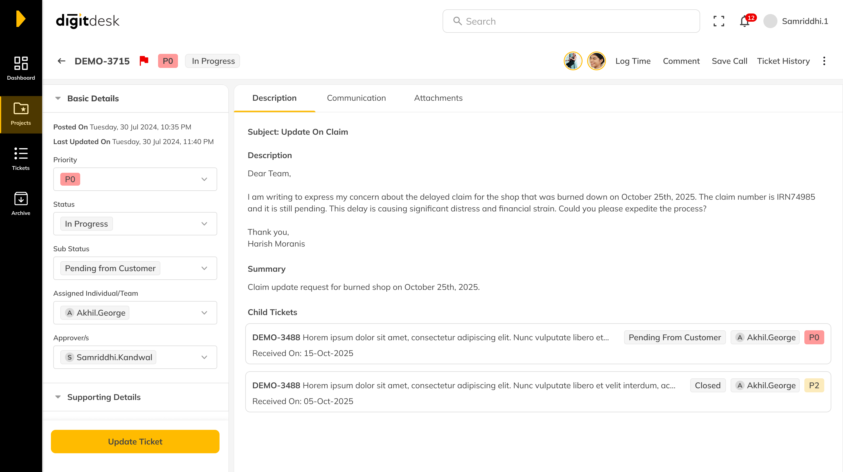
- Communication was unified into a single workspaceEmails, internal comments, attachments, and replies were brought together removing the need to switch between sections to follow or contribute to a conversation.
Before
After
No Colour Grouping
Before
After
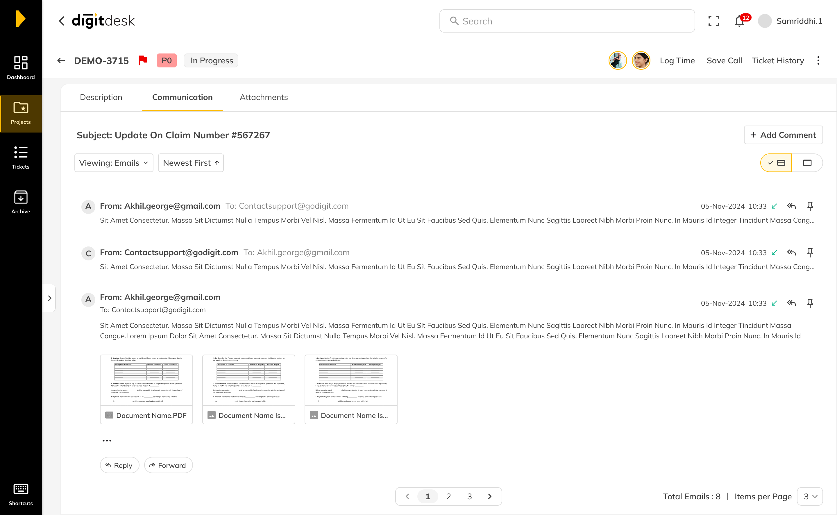
Attachments - A Slight Pivot
From Communication to their own Tab
Attachments were a key part of many tickets. Claims, policy documents, and supporting files were usually shared through email and became part of the ticket thread.Operators often needed these documents before responding to a message.
While attachments belonged to specific emails, the system also collected them in the side panel, placing them at the bottom of a long scroll. This forced users to move between the side panel and the conversation to understand where a document came from.
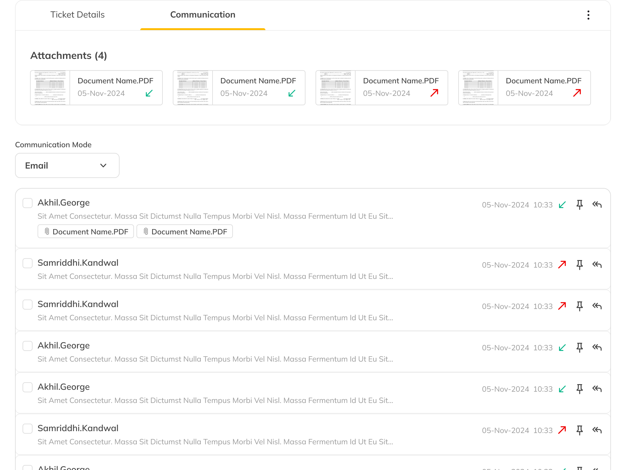
Initial Approach - Attachment within Communication
Attachments Outgrew the Conversation
At first, attachments lived inside the conversation. Since they came from emails, keeping them alongside the thread felt natural. A compact attachment strip surfaced every file before users entered the conversation.
That idea didn't scale. Reviewing tickets showed an average of 11.9 attachments per ticket. Attachments weren't supporting the workflow anymore they had become one.
Before
After
Overall Impact
A Visual Refresh That Became an IA Overhaul
The brief was a visual refresh. The audit reframed it as an IA problem, and I took that case to stakeholders, who approved the expanded scope. That's the outcome I'm proudest of, the redesign exists because the problem got named correctly.
Six fragmented tabs collapsed into two work modes. The side panel went from six scrolling sections to three, action-only. The home screen came down 54% in density. Placement was driven by frequency of use, when assign-to moved out of a deep scroll into the panel, a quick task test showed assigning a ticket drop from about 49 seconds to 13.
Parts of the redesign are now live, phased on the org's own release schedule rather than a fixed plan.