Health Claims Flow Redesign
Timeline: 2 Weeks

What if Filing a Health Claim Meant Leaving the Very Portal Built to File it?
That was the GMC portal an internal tool whose main move was redirecting employees to a public form built for strangers, where they re-typed details the company already held. This is the redesign of the flow they actually use to file.

Before
After




Self Sorting Documents
One upload, the system files it the biggest support-call driver, removed.
52% Faster
5 mins to file, down to 2 mins (Based off of Prototyping)
8 steps → 3 steps
More than half the flow, gone.

Introduction
The Internal Claim Portal Mostly Just Forwarded You to the Public Site
But that's what Digit employees were doing. The internal GMC portal (Group Medical Coverage) was supposed to let them file a health claim: instead it bounced them out to the public godigit.com, where they re-entered details the company already had, on a form built for strangers, not staff.
This case study covers one flow: filing a claim: it's the portal's whole reason to exist.
Digit Employee

Wants to File a Claim
GMC portal
internal

Redirects to
(Problem)
Godigit.com
public · built for strangers
Result: Re-entering data the company already had
What was the Problem?
It Started as an Accounting Problem, Not a Design One
Employee and customer policies share the same number format. When a Digit employee filed on the public site, their claim got lost in the retail pile therefore, the company couldn't cleanly see how much it was spending on claims.
INTIAL BRIEF
Block Digit IDs on the Public Site
A blunt fix: force employees through a proper internal flow. A business measurement problem wearing a UX costume.
→
AFTER AUDIT
The Claims Process itself was the Mess
Not just where the numbers landed. This
changed the question being asked.
→
THE REFRAME
What Actually Matters to Filers
From "separate the claims" to a brief
centred on the people filing them.
Final Problem Statement
How might we make filing a Health Claim intuitive and less time-consuming for the Employees?
Redesign Approach
I Started by Sorting Every Question into Three Piles.
Before redesigning anything, I went through the old flow and put each question it asked into one of three groups: what we already knew, what had become irrelevant, and what belonged together.

Already Knew it → Pre-filled it
If the policy already held it, I pre-filled it instead of asking.

1 Full Screen of Re-typing removed to pre-filled & Confirm

No Longer Applied Questions → Removed it
"who is filing?" That made sense on the public form, but in a corporate policy only employees can file. So it went.
Cut 1 Screen of Entirely

Questions that Belonged Together → Merged it
I categorised information that was personal, Hospitalisation related
Merged 6 Screens into 2
Putting It Back Together
Then I Decided where Everything that Survived Belonged → 8 steps to 3
Sorting told me what to keep. The next call was where each surviving question should live and the answer, almost always, was together with the things it's actually related to, on as few screens as the flow honestly needed.
Old Steps
I am - Removed
Tell us about yourself
For which member
Claimant status
Date of Admission & Discharge
Details about the Accident/ Illness
Details about Hospital
Documents
Became 3 Steps
STEP 1
Who is the Claim for
Absorbs 3 old screens, and the path defining Choice
STEP 2
Hospitalisation Details
Absorbs 3 screens, everything relevant to hospitalisation at one place
STEP 3
Upload Documents
Remains the same, users upload documents at one screen.
Validation
I Checked the Regrouping Instead of Trusting it.
As I reworked the questions, I'd screenshot them and put them in front of people to see if they understood without me explaining. One result went against my own plan: I'd wanted the reason-for-visit fork first, since it drives the whole flow but people reached to say who the claim was for before anything else. So identity opens the form, not the branch. It opens the way people think, not the way the logic tree does.
Before & After
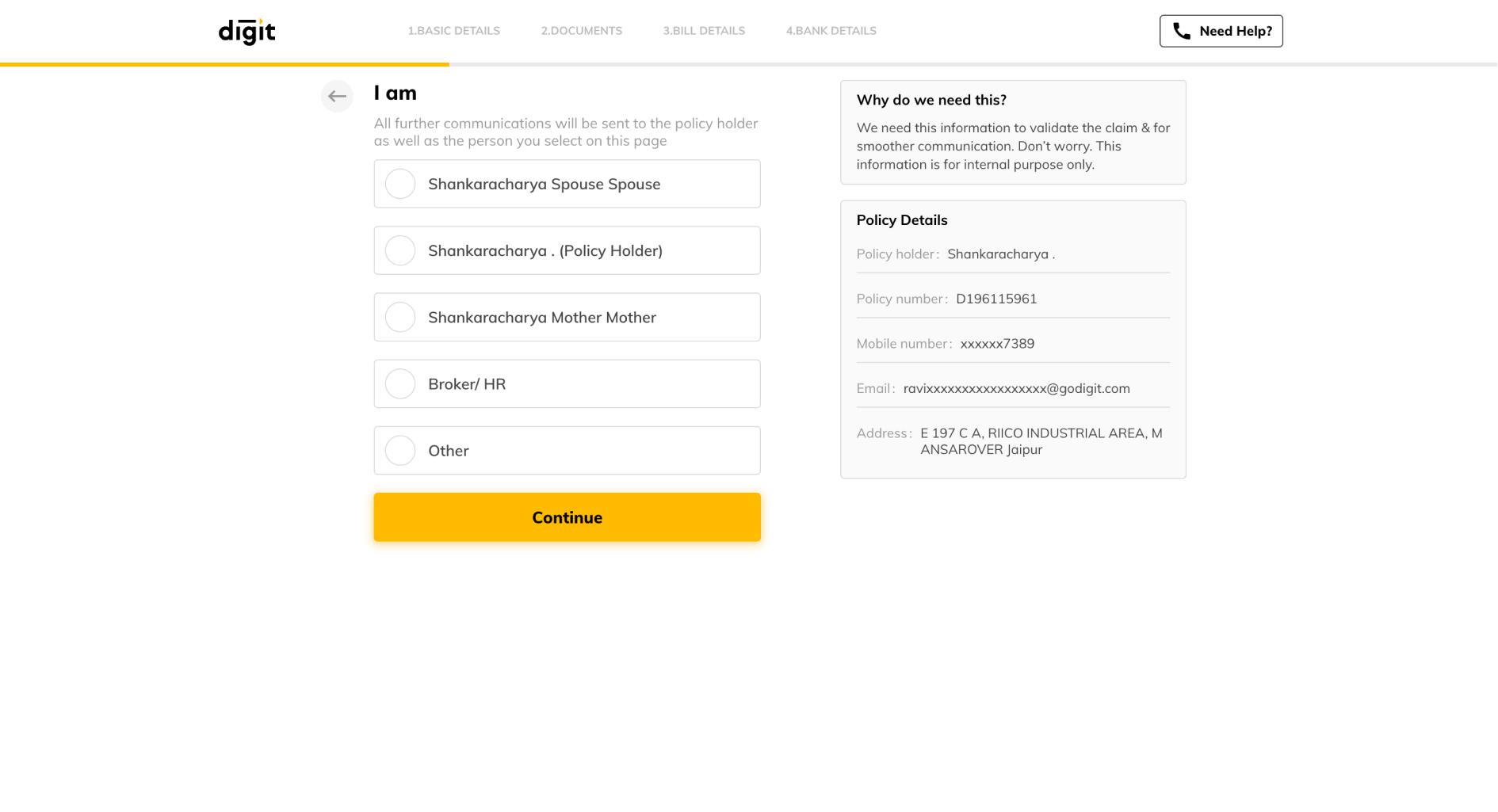
Three screens became the New Step 1
The claim's identity, claim type, and where updates go, now one screen.
Click to see Solutions
All Solutions
Identity Merged
Claim type, direct
Contact pre-filled
Step 2: Tell us about yourself
Step 3: For which member
Step 4: Claimant Status

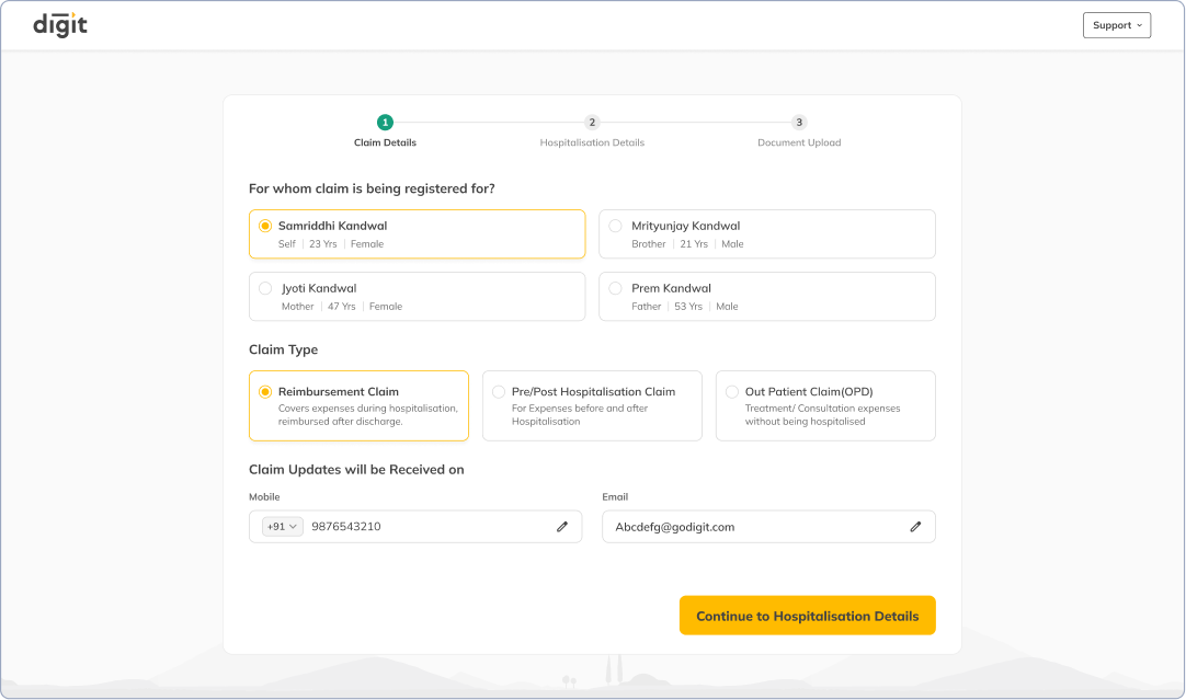

2 screens asked who's filing and who it's for. Only employees file, so "who's filing" went the real question opens the flow.
Name, mobile, and email were re-asked while the policy already held them. Now pre-filled, editable, never typed from scratch.
The old flow asked if the patient was discharged, then inferred the claim. I ask for the claim directly, one question instead of a question about a question.
Three more became New Step 2
Body: Everything about the hospital visit, in one place.
Click to see Solutions
All Solutions
Current Hospital asked First
Fork stays put
Hospital Entered, once
Start now, finish later
Step 5: Date of Admission
Step 6: Details about the Illness
Step 7: Details about the hospital

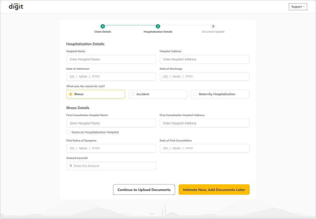
Old flow led with the first hospital visit; people recall recent events better, so current hospitalisation moved up front.
Continue goes to documents. Intimate Now files the claim right away, with 14 days for the paperwork, early intimation speeds processing and tells the insurer how much to reserve.

The fork sits low, so switching it swaps only the fields beneath, nothing above is lost, no screen to go back to.
First consultation hospital is usually the same hospital as admission, so a checkbox helps in not rewriting it again
Document Upload Problem
The upload step stopped assuming people speak claim paperwork.
The single biggest reason people called support wasn't a bug, it was document confusion. They didn't know what was being asked for, or what was still missing. The old upload step assumed a fluency in claim paperwork that most people filing a claim simply don't have.
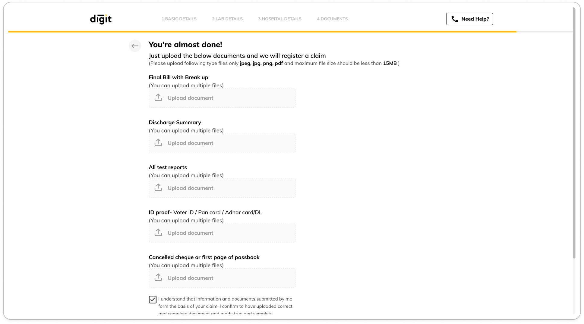
Document Upload Redesign Approach
The Upload Started Matching how Documents Actually Exist
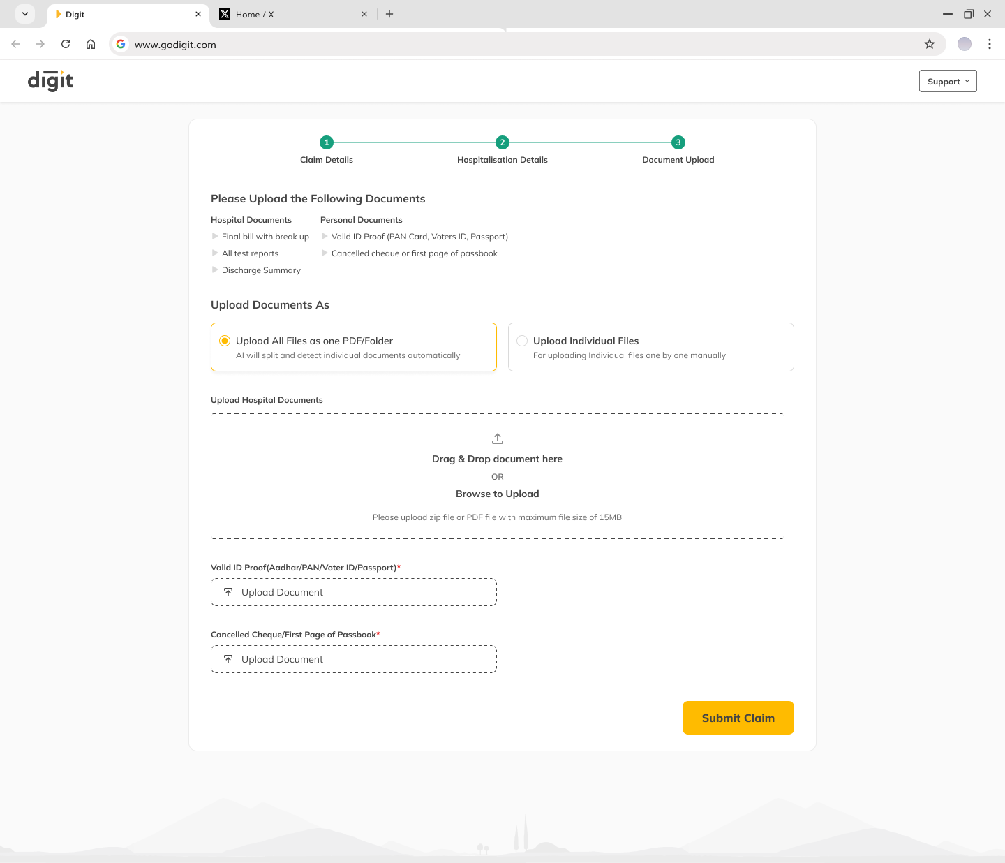
My initial idea was one upload - dump everything in, let the AI split and sort it, user just confirms. The catch: hospital records already come as one combined PDF, but personal documents (ID, cancelled cheque) are separate items the person already holds. Forcing them together just to split them again is make-work.
So hospital records upload combined and get separated, personal ones upload individually the upload mirrors the paperwork instead of fighting it.
Everything a Claim Needs

1 Combined PDF
from the hospital
Separate Personal Items
ID Proof, cheque

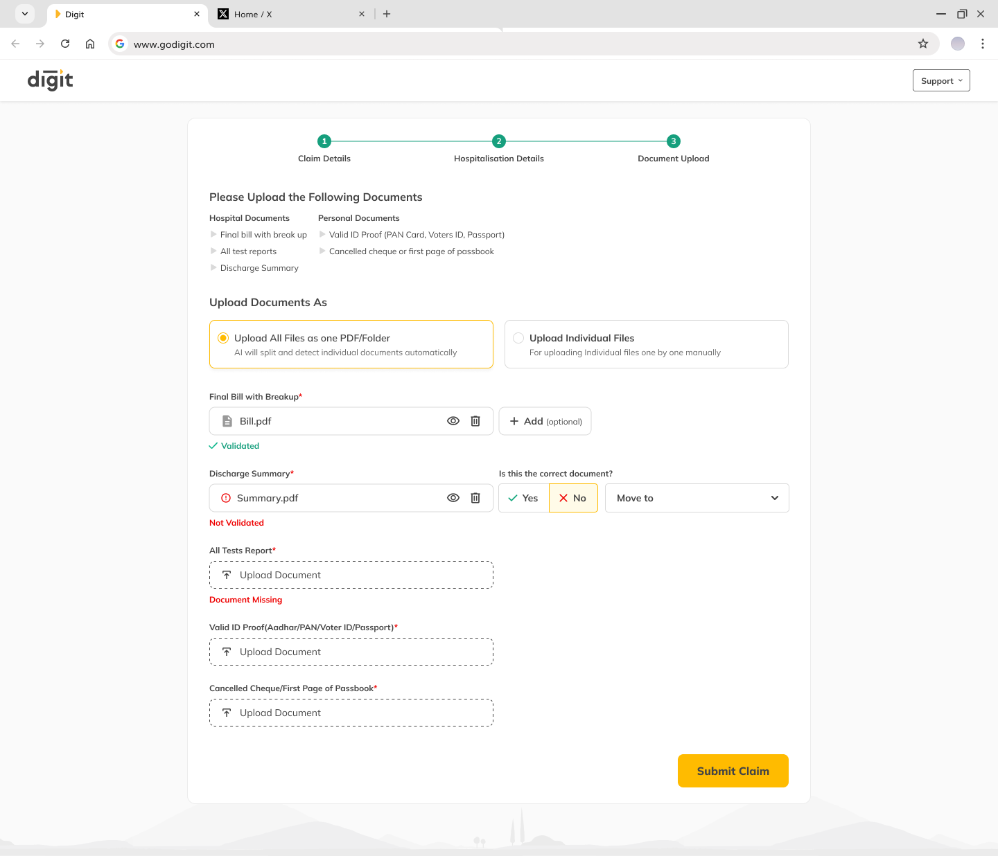
AI splits, this and categorises it, user just confirms whether right or wrong
Separate Items, Uploaded Separately, instead of having to merge with the Hospital documents
Document New Workflow
The AI sorts. The Person decides.
The splitting model was already in the claims pipeline, my work was the flow around it. The design question wasn't "can it classify?" but "what happens when it's wrong, and how does the person catch it without doing the job themselves?"
PERSON
Uploads as is
The hospital PDF goes up whole. Personal documents go up individually. No sorting, no renaming.
AI
Splits the combined file
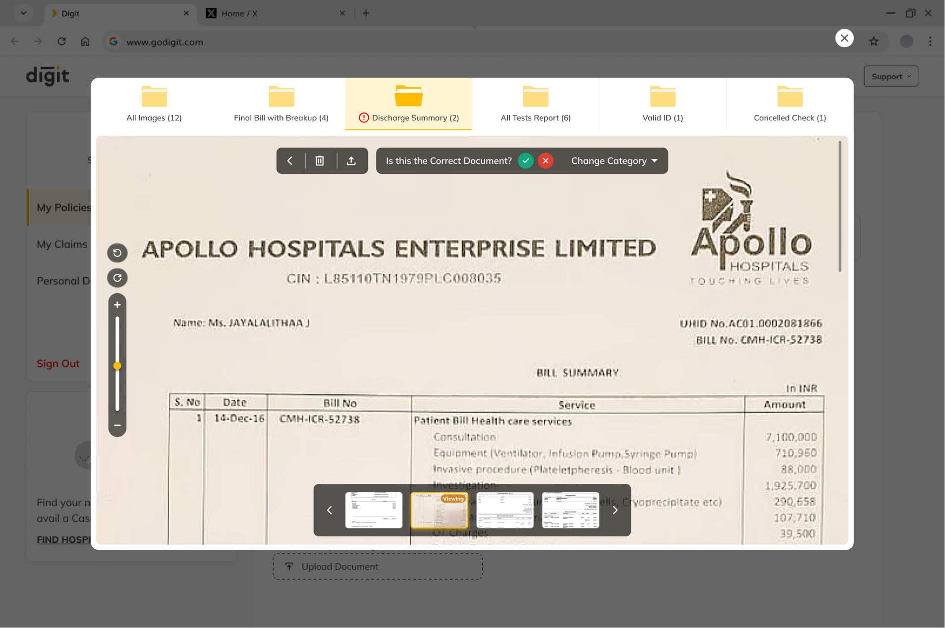
The model separates the bundled PDF into individual
documents the step nobody wanted to do by hand.
AI
Labels and counts each one
Each page lands in a category folder with a count, so gaps are visible without reading every file.
PERSON
Confirms and corrects
Reviews the sort, fixes anything mislabelled on the preview, then submits. The final say stays human.
Impact & Conclusion
Filing Got Roughly Twice as Fast.
Time-on-task, measured in prototype testing, came down a little under half.
5:12
Time to file, Before

2:31
Time to file, After
8 Steps
Before
3 Steps
After
AI Self Sorting
for Hospital Documents